Visualizing Active Session History (ASH) Data With R
One of the easiest ways to understand something is to see a visualization. Looking at Active Session History (ASH) data is no exception and I’ll dive into how to do so with R and how I used R plots to visually present a problem and confirm a hypothesis. But first some background…
Background
Frequently DBAs use the Automatic Workload Repository (AWR) as an entry point for troubleshooting performance problems and in this case the adventure started the same way. In the AWR report Top 5 Timed Foreground Events, the log file sync event was showing up as the #3 event. This needed deeper investigation as often times the cause for longer log file sync times is related to longer log file parallel write times.
Top 5 Timed Foreground Events
~~~~~~~~~~~~~~~~~~~~~~~~~~~~~
                                                           Avg
                                                          wait   % DB
Event                                 Waits     Time(s)   (ms)   time Wait Class
------------------------------ ------------ ----------- ------ ------ ----------
log file sync                     3,155,253       9,197      3    6.4 Commit
Drilling into this a bit deeper the two log file events reported the following in the Foreground Wait Events and Background Wait Events sections of the AWR report:
Foreground Wait Events
-> s  - second, ms - millisecond -    1000th of a second
-> Only events with Total Wait Time (s) >= .001 are shown
-> ordered by wait time desc, waits desc (idle events last)
-> %Timeouts: value of 0 indicates value was  ordered by wait time desc, waits desc (idle events last)
-> Only events with Total Wait Time (s) >= .001 are shown
-> %Timeouts: value of 0 indicates value was < .5%.  Value of null is truly 0

                                                             Avg
                                        %Time Total Wait    wait    Waits   % bg
Event                             Waits -outs   Time (s)    (ms)     /txn   time
-------------------------- ------------ ----- ---------- ------- -------- ------
log file parallel write         659,157     0        526       1      0.2   18.2
It is generally always worth looking at the breakdown of these times, as they are averages. We really want to understand the entire histogram of these wait events. For that we can look at the Wait Event Histogram section of the AWR report as below.
Wait Event Histogram
-> Units for Total Waits column: K is 1000, M is 1000000, G is 1000000000
-> % of Waits: value of .0 indicates value was  % of Waits: column heading of <=1s is truly 1s is truly >=1024ms
-> Ordered by Event (idle events last)

                                                    % of Waits
                                 -----------------------------------------------
                           Total
Event                      Waits   <1ms  <2ms  <4ms  <8ms <16ms <32ms  1s
-------------------------- ------ ----- ----- ----- ----- ----- ----- ----- -----
log file parallel write    661.6K  84.7   9.7   4.7    .4    .1    .3    .0
log file sync              3138.K  14.0  42.8  30.4   7.9   2.3   2.6    .1

Wait Event Histogram Detail (64 msec to 2 sec)
-> Units for Total Waits column: K is 1000, M is 1000000, G is 1000000000
-> Units for % of Total Waits:
   ms is milliseconds
   s is 1024 milliseconds (approximately 1 second)
-> % of Total Waits: total waits for all wait classes, including Idle
-> % of Total Waits: value of .0 indicates value was  Ordered by Event (only non-idle events are displayed)

                                                 % of Total Waits
                                 -----------------------------------------------
                           Waits
                           64ms
Event                      to 2s <32ms <64ms <1/8s <1/4s <1/2s   <1s   =2s
-------------------------- ----- ----- ----- ----- ----- ----- ----- ----- -----
log file parallel write       52 100.0    .0    .0
log file sync               3535  99.9    .1    .0
One thing that you should notice here is there are two sections of Wait Event Histogram; the buckets less than 32ms and buckets greater than 32ms. It is also important to note that only the absence of a value means no timings fell into that bucket – so even though the report shows .0 there are still events in that bucket (read the section description as it mentions this).
We can see from the second histogram section that there were 52 times that log file parallel write was over 64ms as well as 3535 times log file sync was over 64ms. At this point a hypothesis is formed that the two events are correlated – that is, the belief is the long log file parallel write events may be causing the long log file sync. To find data that supports the hypothesis (or not) we can look at the Active Session History (ASH) data to get a more granular view of the wait events.
Diving Into The ASHes With R
If the hypothesis is correct, the ASH data should show times where we observe long log file parallel write and long log file sync waits. One could write SQL against V$ACTIVE_SESSION_HISTORY to collect all the samples that may demonstrate the hypothesis – e.g. collect a list of sample ids for each event and examine them for overlap, but a visualization is worth a thousand words.
One way to get quick and easy visualizations from ASH data is to use R. R has become a very popular tool for those doing statistical analysis and it has some quite useful graphing and plotting packages built in. R can connect to Oracle via a JDBC package which makes importing data trivial.
Here is a plot that I put together using R for ~300 sample ids (~5 minutes) from ASH (recall that TIME_WAITED is in microseconds):
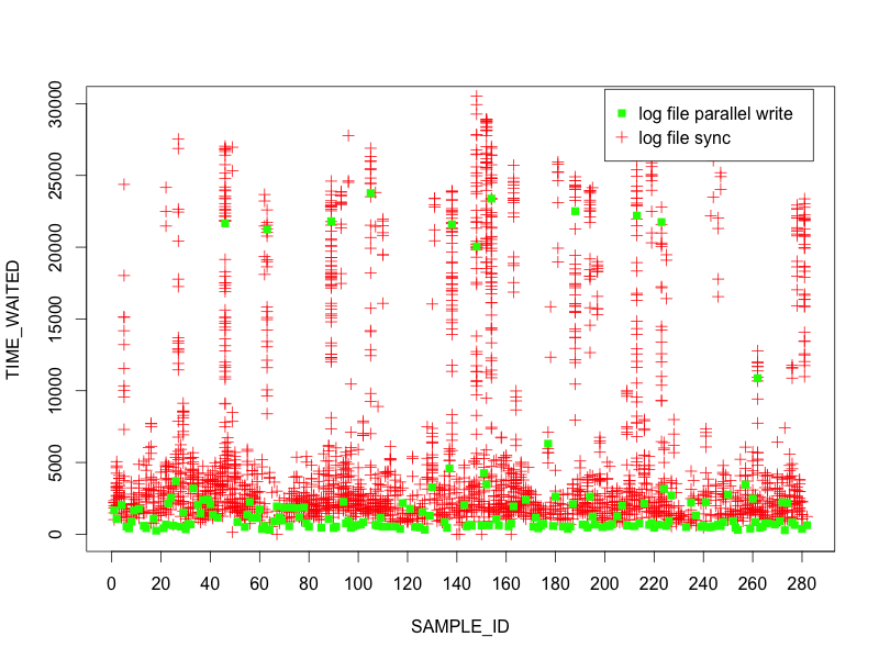
As you can see from the plots, nearly every time there is a long log file parallel write there are also numerous long log file sync events. This data supports the hypothesis.
Averages Suck
Most any statistician (or anyone keen on numbers and stats) will tell you averages suck. This does not mean averages are not useful, but one has to keep in mind averages can hide infrequent outliers (which may make them a tad bit evil). For instance, AWR is reporting an average of 1ms for log file parallel write but we can see that there are several that are falling in the 20ms range in the 5 minute capture. If we zoom in on the graph (set the y axis at a max of 3ms), we can understand why:
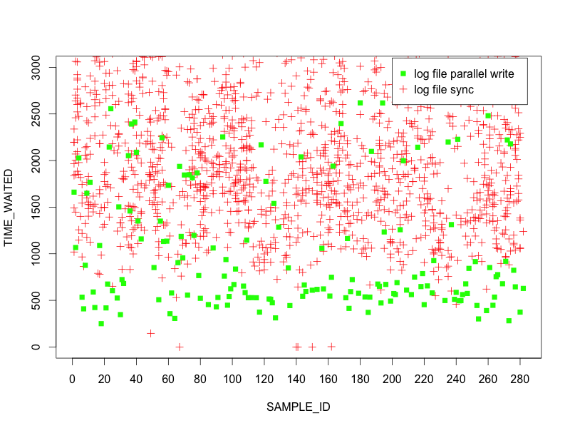
Most of the log file parallel write events are coming in around 0.5ms so even with some 20ms outliers it still yields an average of 1ms, thus hiding the magnitude of impact for the outliers. This is why drilling down into the ASH data was important for us to understand the scope of the issue.
With More Data Comes More Questions
At this point, the visualization of ASH data shows a strong correlation between log file sync and log file parallel write outliers, but the root cause has not yet been identified. Perhaps there is more insight lurking in the ASH data?
Given this is an OLTP workload and log file parallel write is an IO operation, perhaps it’s worth looking at another IO operation like, say, db file sequential read - single block IO times.
In the below plot, I’ve taken a 60 second window of ASH data and plotted all the db file sequential read events.
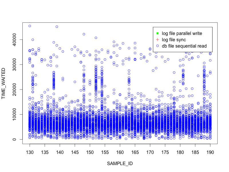
Interestingly, there are several samples where the IOs are taking significantly longer than most – the majority are below 10ms but we see a few samples where there are groups in the 20ms or more range. Let’s add the log file sync events to the plot.
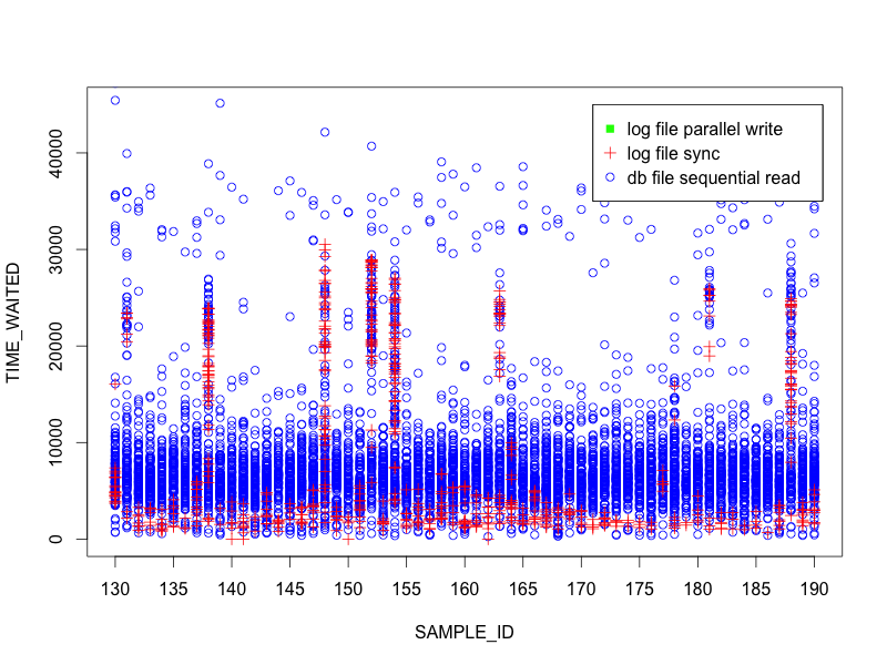
Hmmm… even more interesting. The data is showing a correlation between log file sync and db file sequential read. Any bets on what the plot looks like if log file parallel write is added?
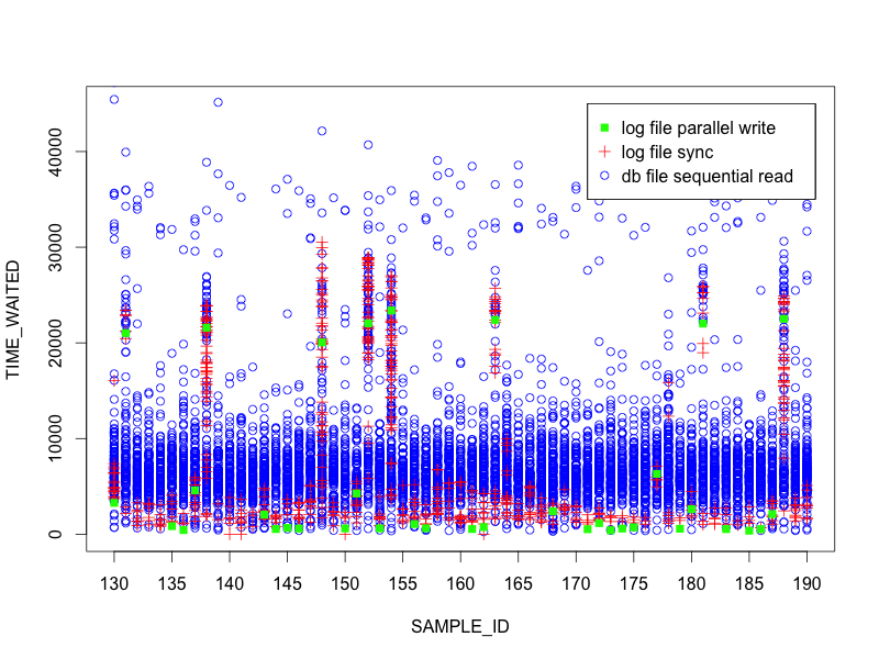
Very interesting. The data is showing us that all 3 events are correlated strongly. Clearly we are on to something here…and using R to plot the ASH data was an easy way to present and understand it visually.
Summary
While this blog post did not go into specific root cause, it was a healthy journey in debugging and data driven analysis. Keep in mind that just because AWR averages look good, don’t overlook the fact that the event histograms should also be reviewed to see if there are outliers. R allows an easy way to put scatter plots of event times together to get a nice visual of what is going on.
Source Code
Here is the code I used to do the analysis. It’s pretty straight forward and well commented (I think). Enjoy! https://gist.github.com/gregrahn/1502596 I’ll also mention that I use the RStudio IDE for R.